தரவுகளை விளக்குவதற்காக வரைபுகளைப் பயன்படுத்தல்
\"இந்த எண்களை ஒரு கதையாகச் சொல்ல முடியுமா?\" — அதுவே graphs + charts-ன் நோக்கம். Tables of numbers are hard to digest at a glance — but the same data converted to a **graph** (வரைபு) reveals trends, comparisons, patterns instantly. கடைசி அலகாக நாம் — (1) எப்போது எந்த வரைபு பயன்படுத்துவது, (2) Bar charts, line graphs, pie charts, climographs construction, (3) data interpretation, (4) common mistakes — பற்றி அறிவோம்.

1. Why Visualize Data?
Geography deals with numbers everywhere — populations, rainfall, temperatures, crop yields, export values, GDP. These numbers as tables are hard to compare. Visualizing them as graphs:
- Reveals trends over time at a glance.
- Allows quick comparisons across categories.
- Shows proportions + relationships.
- Identifies outliers + anomalies.
- Communicates findings to non-technical audiences.
- Reveals spatial patterns via maps + cartograms.
2. Choose Right Graph Type
| Goal | Best Graph | Examples |
|---|---|---|
| Show trend over time | Line graph | Population growth, temperature time-series, GDP trend |
| Compare categories | Bar chart (vertical/horizontal) | Population by district, export by commodity |
| Compare multiple categories over time | Multiple bar / Grouped bar | Imports vs exports per year |
| Show parts of whole | Pie chart | Land use breakdown, ethnic composition |
| Compare two related variables | Scatter plot | Rainfall vs crop yield |
| Climate at a place | Climograph (combined bar + line) | Monthly rainfall (bars) + temperature (line) |
| Spatial data | Choropleth map (shaded) | Population density by district |
| Hierarchical | Treemap | Export value by commodity nested |
| Frequency distribution | Histogram | Income distribution, rainfall distribution |
3. Line Graph (கோட்டு வரைபு)
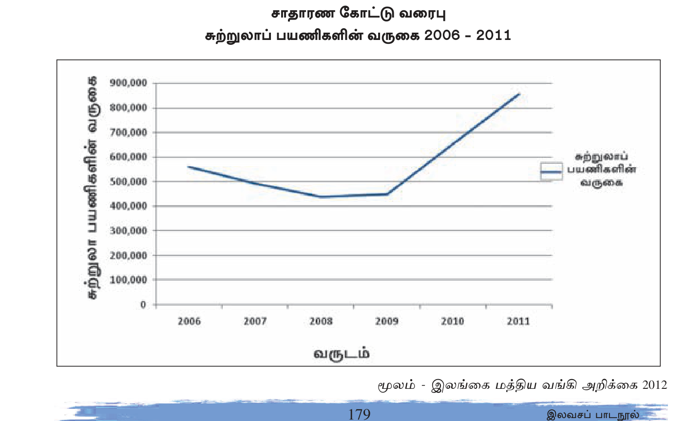
Use
Tracking changes over time. Best for continuous data — temperature, population, GDP, etc.
Construction
- Horizontal axis (X) = independent variable, usually time (years).
- Vertical axis (Y) = dependent variable being measured.
- Use suitable + uniform scale on both axes.
- Plot each (x, y) value as a point.
- Connect points with smooth line (or straight segments).
- Label both axes clearly with units.
- Title at top.
- Source citation at bottom.
- For comparisons, use multiple lines with legend (different colors/styles).
Example: SL Population Growth 1871-2012
X-axis: years (1871, 1881, 1891, ... 2012); Y-axis: population in millions. Single ascending line showing J-curve growth — easy to see acceleration.
Variations
- Multiple line graph — compare multiple data series. e.g., population growth of SL vs India.
- Compound line graph — areas filled to show component contributions.
- Cumulative line — running total over time.
4. Bar Chart (வரிக் கட்டை வரைபு)
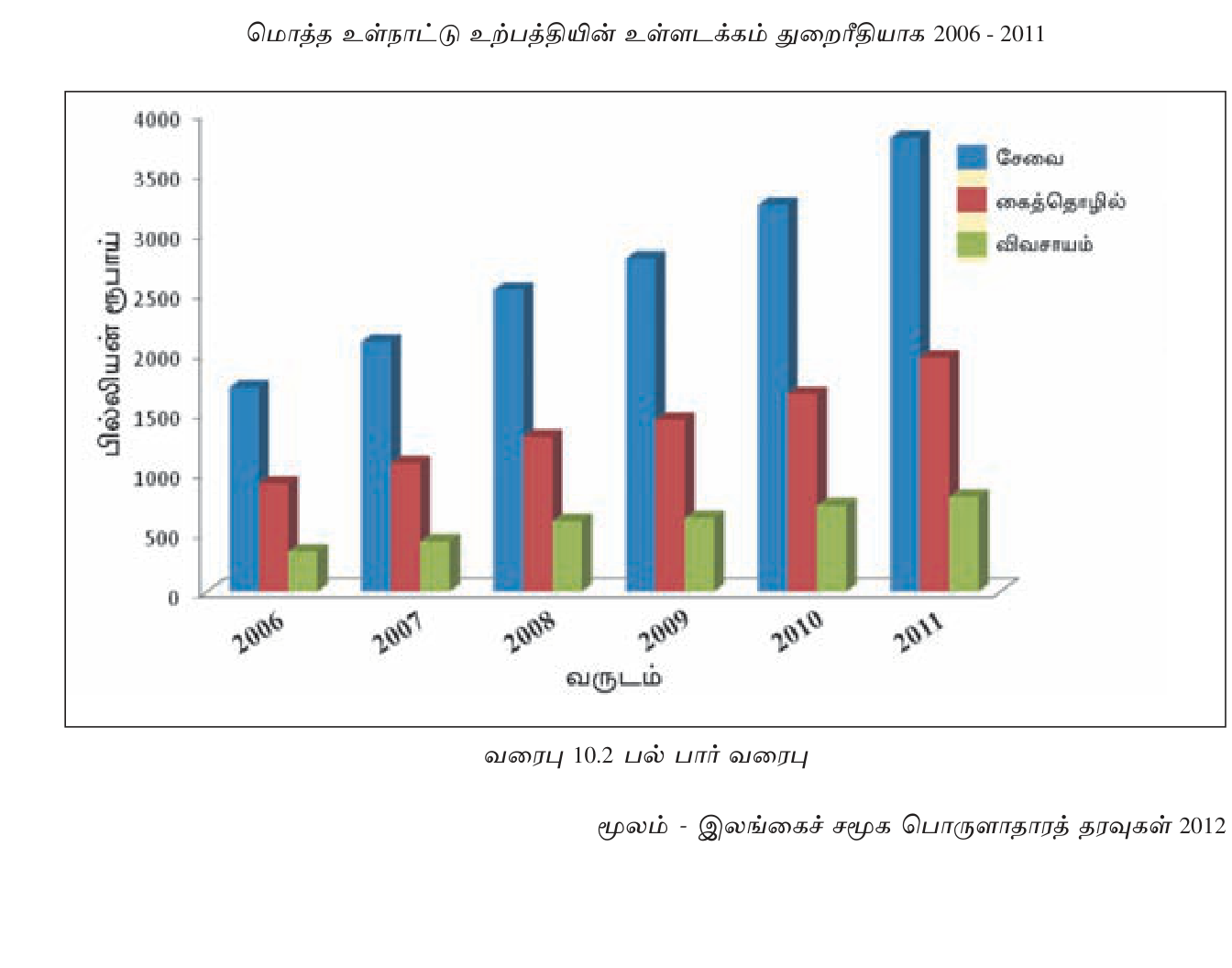
Use
Comparing discrete categories. Best for nominal or ordinal data — countries, districts, products.
Construction
- One axis (usually X) for categories.
- Other axis (usually Y) for values.
- Draw bars equal width with equal gaps between.
- Bar height/length proportional to value.
- Label both axes.
- Label each bar (category name) clearly.
- Title + source.
- Order: alphabetical, or by value descending (often most informative).
Variations
- Simple bar chart — one variable per category.
- Multiple/Grouped bar — multiple variables per category (e.g., 2020 vs 2024 by district).
- Stacked bar — total + sub-component breakdown.
- 100% stacked — show proportional composition.
- Horizontal bar — long category names readable.
- Population pyramid — special form showing age-sex structure (two back-to-back bars).
Example: SL Districts by Population
X-axis: district names (Colombo, Gampaha, Kandy, ...); Y-axis: population in thousands. Tallest bar = Colombo. Easily ranked + compared.
5. Pie Chart (வட்ட வரைபு)
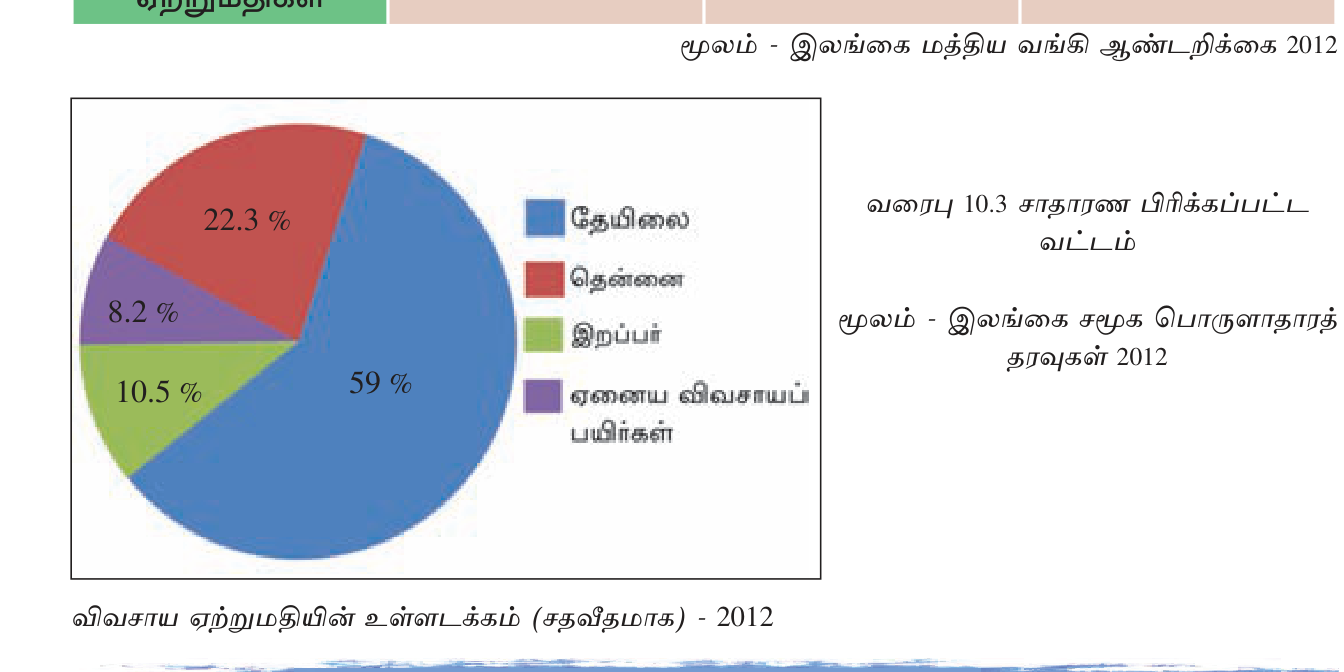
Use
Show proportional composition of a whole. Best for few categories (4-7) where sum = 100%.
Construction
- Calculate angle for each category: (category value ÷ total) × 360°.
- Draw circle.
- Use protractor to mark angles + draw radii.
- Color/shade each slice differently.
- Label each slice with category name + percentage.
- Title + source.
- Order: largest first (clockwise from 12 o\'clock).
Example: SL Ethnic Composition 2012
Sinhalese 74.9% = 270° angle; SL Tamil 11.2% = 40°; SL Moor 9.2% = 33°; Indian Tamil 4.2% = 15°; Others 0.5% = 2°. Sum = 360°. Visually clear majority + minorities.
When NOT to use
- Too many categories (>7) — slices too thin.
- Categories have nearly equal values — hard to distinguish.
- Show changes over time — line graph better.
- Show negative values — pie charts cannot.
6. Climograph (காலநிலை வரைபு)
Use
Show a location\'s climate at a glance — monthly rainfall + temperature combined.
Construction
- X-axis: 12 months (Jan-Dec).
- Left Y-axis: temperature (°C).
- Right Y-axis: rainfall (mm).
- Plot temperature as line (using left Y-axis).
- Plot rainfall as bars (using right Y-axis).
- Label axes + title with location.
Example: Nuwara Eliya Climograph
Temperature line: ~13-16°C throughout year (relatively flat — high elevation cool). Rainfall bars: high in May-Sep (SW monsoon ~300mm/month); high again Oct-Dec (NE monsoon); dry Jan-Mar.
Reading patterns
- Equatorial: consistently high T + heavy rain year-round (Singapore).
- Tropical wet/dry: high T, distinct dry season (Yala SL summer).
- Mediterranean: hot dry summer, mild wet winter.
- Temperate: variable T, moderate rainfall.
- Continental: wide T range, summer rain.
- Tundra/Arctic: cold T, low precipitation.
7. Other Graph Types
Scatter Plot (சிதறிய புள்ளி வரைபு)
Two related variables as (x,y) points. Reveals correlation. Positive correlation: as X increases, Y increases (e.g., income vs life expectancy across countries). Negative: opposite.
Histogram (வரிசை வரைபு)
Bar-chart-like but shows frequency distribution. Continuous data binned into intervals. Y-axis = frequency. Used for: rainfall distribution, income distribution.
Choropleth Map (படிமப் பகுதி வரைபு)
Regional units shaded by data values. Darker = higher. e.g., population density per district map. SL versions widely used.
Cartogram
Distortion of map by data — country/district size proportional to a variable (population, GDP).
Pictograph
Categories represented by repeated icons proportional to value. e.g., one person icon = 1 million people.
8. Sample Exercises

Exercise 1: Best graph for SL population 1871-2012
Answer: Line graph — single line tracking time series; reveals J-curve growth.
Exercise 2: SL Ethnic composition 2012
Answer: Pie chart — categorical proportions sum to 100%; visualizes majority + minority.
Exercise 3: Compare SL districts by population
Answer: Bar chart (descending order) — easy comparison across discrete categories.
Exercise 4: SL imports vs exports 2010-2024
Answer: Multiple line graph (two lines) or grouped bar chart (one bar per metric per year).
Exercise 5: Climate of Anuradhapura
Answer: Climograph — temperature line + monthly rainfall bars on same x-axis.
Exercise 6: Tea exports 2010-2024 share by destination country
Answer: Pie chart for each year OR stacked area chart over time.
9. Common Mistakes + Best Practices
Common Mistakes
- Wrong graph choice — pie chart for time-series; bar chart for proportions.
- Missing axis labels + units — incomprehensible.
- Inconsistent scale — distorts perception.
- Too many categories in pie chart → unreadable.
- 3D effects on bar/pie → distort perception.
- Truncated Y-axis → exaggerates differences.
- No title or source — graph orphaned.
- Hard-to-read fonts/colors.
- Pie slices not in size order.
- Climograph: temperature on rainfall axis or vice versa.
Best Practices
- Clear, descriptive title.
- Label all axes with units.
- Show data source.
- Choose appropriate scale — avoid distortion.
- Use color thoughtfully — avoid red/green confusion (color blind).
- For pie: arrange slices by size + label percentages.
- For line: include legend for multiple series.
- Simplicity — fewer elements = clearer message.
- Highlight key insight in title/annotation.
- For maps: include scale + north arrow + legend.
- Choose graph for purpose: Trend = line; Compare = bar; Proportion = pie; Climate = climograph; Spatial = choropleth.
- Line graph: time-series, continuous, X=time + Y=value.
- Bar chart: compare categories. Simple/multiple/stacked/horizontal.
- Pie chart: proportions sum to 100%. Calc angle = (value/total) × 360°. Max 7 categories.
- Climograph: temperature line + rainfall bar; dual Y-axis.
- Always include: title + axes labels (with units) + scale + source.
- Avoid: 3D effects, truncated axes, too many categories, wrong graph choice.
- Population pyramid: back-to-back horizontal bars for age-sex structure.
- Scatter plot: for correlation between 2 variables.
- Choropleth map: regional shading by data value.
- Pie chart for time-series — use line graph instead.
- Bar chart for proportions — use pie chart instead.
- Climograph: temperature on right axis, rainfall on left — convention is temp LEFT, rain RIGHT (but as long as labeled clearly, acceptable).
- Pie angle calculation: (value/total) × 360° NOT 100°.
- Truncated Y-axis exaggerates differences.
- No legend for multiple series — viewer confused.
- 3D effects in pie chart distort proportions.
- Bar width inconsistent — looks unprofessional.
- Climograph reading: temperature = line value (not bar height); rainfall = bar height.
✅ விரைவுச் சோதனை
முக்கியக் கருத்துக்களை உறுதிப்படுத்துங்கள். தவறான விடைகள் உங்கள் தவறுக் குறிப்பேட்டில் சேமிக்கப்படும்.
🖊 கட்டுரை வினாக்கள் (பகுதி II)
பரீட்சை வடிவில் கட்டமைப்பு வினாக்கள். முதலில் நீங்களே எழுதுங்கள்; பின்னர் மாதிரி விடையைத் திறந்து சரிபாருங்கள்.
விடைத் திட்டம் — சேர்க்க வேண்டிய புள்ளிகள்:
- Line graph: trends time-series
- Bar chart: compare categories
- Pie chart: proportions
- Climograph: climate
- Scatter: correlation
- Histogram: frequency
- Choropleth: spatial
- Cartogram: distorted map
- Pictograph: visual icons
- Population pyramid: age-sex
**1. Line Graph (கோட்டு வரைபு)**
- **Use:** Show trends + changes over time. Continuous data.
- **X-axis:** time (years, months); **Y-axis:** value.
- **Examples:** Population growth 1871-2012; GDP trend; temperature time-series.
- **Variations:** Multiple line (compare countries); compound line (stacked area); cumulative line.
- **Strength:** Reveals trends + acceleration + inflection points at a glance.
**2. Bar Chart (வரிக்கட்டை வரைபு)**
- **Use:** Compare values across discrete categories.
- **Construction:** Equal-width bars; spaced; height = value.
- **Examples:** Population by district; export value by commodity; rainfall by month.
- **Variations:** Simple, multiple/grouped, stacked, 100% stacked, horizontal, population pyramid.
- **Strength:** Easy comparison; ranking via descending order.
**3. Pie Chart (வட்ட வரைபு)**
- **Use:** Show proportional composition (parts of whole). Categories sum to 100%.
- **Angle formula:** (value/total) × 360°.
- **Examples:** SL ethnic composition; export commodity share; land use breakdown.
- **Limits:** Max ~7 categories (slices too thin); not for time-series; not for negative values.
- **Strength:** Visual proportions; majority/minority obvious.
**4. Climograph (காலநிலை வரைபு)**
- **Use:** Show a location's climate — monthly temperature + rainfall together.
- **X-axis:** 12 months; **Left Y-axis:** temperature (°C, as line); **Right Y-axis:** rainfall (mm, as bars).
- **Examples:** Nuwara Eliya, Anuradhapura, Colombo climographs.
- **Strength:** Dual data series; reveals climate zone at a glance (equatorial, tropical wet/dry, Mediterranean, temperate, polar).
**5. Scatter Plot (சிதறிய புள்ளி வரைபு)**
- **Use:** Show correlation between two continuous variables.
- **Construction:** Each (x, y) data point plotted; trend line optional.
- **Examples:** Income vs life expectancy across countries; rainfall vs crop yield.
- **Reveals:** Positive correlation (both rise together), negative (opposite), no correlation, outliers.
- **Strength:** Identifies relationships between variables.
**6. Histogram (வரிசை வரைபு)**
- **Use:** Show frequency distribution of continuous data binned into intervals.
- **Construction:** X-axis = data ranges (bins); Y-axis = frequency count. Bars touching (no gaps).
- **Examples:** Rainfall distribution; income distribution; age distribution.
- **Strength:** Reveals data shape — normal, skewed, bimodal.
**7. Choropleth Map (படிமப் பகுதி வரைபு)**
- **Use:** Show spatial distribution of data by regional units.
- **Construction:** Map of regions; each shaded by data value (darker = higher).
- **Examples:** Population density by district; literacy rate by country; deforestation by province.
- **Strength:** Spatial patterns + geography intuition.
- **Limits:** Hides intra-region variation; size doesn't reflect importance.
**8. Cartogram**
- **Use:** Show data by distorting geographic size proportional to a variable.
- **Examples:** World cartogram by population (Africa enlarged, Russia shrunk); GDP cartogram (USA enlarged).
- **Strength:** Reveals data magnitude vs geographic size.
**9. Pictograph (படிம வரைபு)**
- **Use:** Show data using repeated icons proportional to value.
- **Construction:** Choose icon (person, factory, tree); decide unit value (1 icon = 1M); repeat icons.
- **Examples:** Population by country with person icons.
- **Strength:** Visually appealing; intuitive for general audience.
- **Limits:** Imprecise for exact comparison.
**10. Population Pyramid (சனத்தொகை கோபுரம்)**
- **Use:** Show age-sex structure of a population.
- **Construction:** Horizontal back-to-back bar chart. Left side = males; right side = females. Each row = age cohort (0-4, 5-9, ...).
- **Examples:** SL pyramid 2012 (narrowing top showing aging); Niger pyramid (broad base showing youthful population).
- **Reveals:** Demographic stage (broad base = stage 2-3; rectangular = stage 4; inverted = stage 5).
- **Strength:** Compact demographic snapshot.
**Choosing the Right Graph — Decision Tree:**
1. **Showing change over time?** → Line graph.
2. **Comparing discrete categories?** → Bar chart.
3. **Showing proportions/composition?** → Pie chart.
4. **Showing climate?** → Climograph.
5. **Showing correlation?** → Scatter plot.
6. **Showing spatial data?** → Choropleth map.
7. **Showing distribution?** → Histogram.
8. **Showing demography?** → Population pyramid.
9. **Multiple of the above?** → Combined dashboard.
**Best Practices:**
- **Title** (clear + descriptive).
- **Axis labels with units**.
- **Scale appropriate + consistent** (don't truncate axes misleadingly).
- **Legend** for multiple series.
- **Source citation**.
- **Color thoughtful** (avoid red-green for color-blindness).
- **Simplicity** — less is more.
- **Avoid 3D effects** (distort perception).
- **Show data accurately** (no exaggeration).
**Sample Decisions (SL Geography):**
- SL population 1871-2012 → Line graph.
- SL districts by population → Bar chart (descending).
- SL ethnic composition 2012 → Pie chart.
- Climate of Anuradhapura → Climograph.
- Rainfall vs paddy yield → Scatter plot.
- Forest cover by province → Choropleth map.
- Age-sex structure → Population pyramid.
- Tea export destinations → Pie chart or treemap.
Master these graph types + their appropriate use, and you can communicate any geographic data clearly + effectively.
விடைத் திட்டம் — சேர்க்க வேண்டிய புள்ளிகள்:
- Climograph = monthly temperature line + rainfall bars on same X-axis
- Dual Y-axis (temp left, rain right)
- Climate zones: equatorial, tropical wet/dry, monsoon, Mediterranean, desert, temperate, continental, polar/tundra
- SL climographs by zone
- Reading patterns
- Common errors
**Construction (Step-by-Step):**
1. **Setup axes:**
- **X-axis:** 12 months (Jan, Feb, Mar, ..., Dec).
- **Left Y-axis:** temperature in °C (with scale; usually 0-40°C for tropical, -30 to +30 for temperate).
- **Right Y-axis:** rainfall in mm (with scale; usually 0-600 mm).
2. **Plot temperature:** For each month, plot the **monthly mean temperature** value using the left Y-axis. Connect points with a smooth line.
3. **Plot rainfall:** For each month, draw a **bar** representing monthly total rainfall using the right Y-axis. Bars touch each other (no gaps).
4. **Title:** Location name + period covered (e.g., "Climograph for Colombo, 1991-2020").
5. **Labels:** Both Y-axes with units. X-axis with months.
6. **Legend** (if needed): Temperature line; Rainfall bars.
7. **Source:** Department of Meteorology Sri Lanka or other.
**Reading a Climograph:**
- **Temperature line height** → mean monthly temperature.
- **Temperature line steepness** → seasonal variation.
- **Bar heights** → monthly rainfall.
- **Rain bar pattern** → wet/dry seasons.
- **Annual range** = highest - lowest temperature.
- **Annual total** = sum of all monthly rainfalls.
**Major Climate Zone Patterns:**
**(1) Equatorial Rainforest (Singapore, Colombo wet zone):**
- Temperature: ~25-28°C, very stable (range <3°C).
- Rainfall: heavy (200+ mm) most months, no clear dry season.
- Annual total: 2000+ mm.
- Pattern: "flat-top" temperature, sustained high rainfall.
**(2) Tropical Wet-Dry / Savanna (Hambantota, Jaffna SL dry zone):**
- Temperature: hot 25-32°C all year.
- Rainfall: distinct wet season (1 monsoon) + dry season.
- Annual total: 800-1500 mm.
- Pattern: high temperature, uneven rainfall.
**(3) Tropical Monsoon (most SL, India):**
- Temperature: hot 22-32°C.
- Rainfall: two distinct rainy seasons (SW + NE monsoons).
- Pattern: bimodal rainfall.
**(4) Mediterranean (Athens, Cape Town):**
- Temperature: mild winter (10°C), hot dry summer (28°C).
- Rainfall: winter rain, summer dry.
- Pattern: inverse temp + rain (hot when dry, cool when wet).
**(5) Hot Desert (Sahara, Arabia):**
- Temperature: extreme hot (35-45°C summer, mild winter).
- Rainfall: very low (<250 mm/year).
- Pattern: high T, near-zero rainfall.
**(6) Temperate Maritime (London, Paris, Auckland):**
- Temperature: moderate (3-20°C); cool winter, mild summer.
- Rainfall: moderate (~500-1000 mm) year-round.
- Pattern: temperature gentle curve, rainfall consistent.
**(7) Continental (Moscow, Chicago, central USA):**
- Temperature: wide range — cold winter (-10°C), hot summer (25°C).
- Rainfall: moderate, often peaks in summer.
- Pattern: steep temperature curve.
**(8) Mountain / Highland (Nuwara Eliya, Darjeeling, Tibet):**
- Temperature: cool throughout (~13-16°C SL highlands).
- Rainfall: variable but often high; SW monsoon peaks in SL hills.
- Pattern: relatively flat low temperature + variable rainfall.
**(9) Tundra / Polar (Murmansk, Antarctic stations):**
- Temperature: cold (-30 to +5°C); long winter, short summer.
- Rainfall: low (<300 mm).
- Pattern: deep V or rectangular temperature, low rainfall.
**Sri Lanka Climograph Examples:**
**Colombo (wet zone, lowland):**
- T: stable ~27°C year-round.
- Rain: dual peaks May-Sep (SW monsoon) and Oct-Dec (NE monsoon); somewhat dry Feb.
- Annual: ~2400 mm.
**Nuwara Eliya (wet zone, highland):**
- T: cool 13-16°C; coldest Jan-Feb (~13°C); warmest Apr-May (~16°C).
- Rain: very heavy May-Sep (SW monsoon, 300+ mm/month); moderate Oct-Dec.
- Annual: ~1900 mm.
**Anuradhapura (dry zone, lowland):**
- T: hot 24-31°C; warmest Apr-May (~31°C); coolest Dec-Jan (~25°C).
- Rain: main rain Oct-Dec (NE monsoon, 200-300 mm/month); dry Feb-Sep.
- Annual: ~1300 mm.
**Hambantota (dry zone, southeast):**
- T: hot 26-30°C.
- Rain: distinct dry Mar-Sep, wet Oct-Dec.
- Annual: ~1000 mm.
**Common Errors in Climograph:**
1. **Plotting temperature as bars + rainfall as line** — reverse convention.
2. **Single Y-axis** — values overlap and confuse.
3. **No units on Y-axes** — incomprehensible.
4. **Missing months** or rearranged order (must be Jan-Dec).
5. **Not labeling which Y-axis is which** — ambiguous.
6. **Inconsistent scale across climographs** — hard to compare.
7. **Confusing temperature scale extending into negative when irrelevant** — Sri Lanka never sees -°C.
**Reading Skills (Common Exam Questions):**
1. What is the warmest/coldest month?
2. What is the wettest/driest month?
3. Calculate annual temperature range.
4. Calculate annual rainfall total.
5. Identify climate type/zone.
6. Identify which season is the wet/dry season.
7. Suggest agriculture suitability based on climate.
8. Compare with another climograph.
Mastering climograph reading is essential for understanding world climate patterns + Sri Lanka's diverse climate zones.
விடைத் திட்டம் — சேர்க்க வேண்டிய புள்ளிகள்:
- Pie chart = parts of whole sum 100%
- Angle = (value/total) × 360°
- Max 7 categories typical
- Order largest first clockwise from 12
- Common SL examples
- Avoid 3D + truncation
- Alternatives when not suitable
**When to Use:**
- Show **proportional composition** of a whole.
- Sum of all categories = 100% (or close).
- Limited number of categories (typically **4-7 maximum**).
- For single time point/snapshot.
- For nominal/categorical data.
**When NOT to Use:**
- Many categories (>7) — slices too thin to read.
- Categories with nearly equal values — hard to distinguish.
- Showing change over time — use line graph.
- Showing negative values — pie can't represent.
- Showing absolute values for comparison — bar chart better.
- Showing parts of multiple wholes — stacked bar or multiple pies.
**Construction Steps:**
**Step 1: Calculate slice angles.**
For each category:
- **Angle = (Category value / Total) × 360°**
- e.g., if Sinhalese = 74.9% of population: (74.9/100) × 360 = **269.6°** (≈ 270°).
Alternative formula in percent:
- **Angle = % × 3.6** (since 1% = 3.6°).
- e.g., 74.9% × 3.6 = 269.6°.
Sum check: All angles should sum to **360°** (or very close, allowing for rounding).
**Step 2: Draw the circle.**
Use a compass to draw a circle on graph paper. Choose appropriate size (5-10 cm radius typical).
**Step 3: Mark starting point.**
Start from **12 o'clock position** (top of circle). This is convention.
**Step 4: Use protractor.**
For each category in order (largest first):
- Place protractor center at circle center, 0° aligned with 12 o'clock.
- Mark the angle from 12 o'clock position **clockwise**.
- Draw a line from center to that point.
- Repeat for next category from previous endpoint.
**Step 5: Color/shade slices.**
Each slice a different color or pattern. Use color blindness-friendly palette (avoid red-green confusion). Or use shading patterns for black-and-white printing.
**Step 6: Label slices.**
- Category name + percentage on each slice.
- For small slices, use external labels with arrows.
- Font readable.
**Step 7: Title + Source.**
Title at top: "Composition of [variable] [location, year]."
Source at bottom: "Source: [agency]. [date]."
**Example: SL Ethnic Composition 2012**
| Category | % | Angle |
|---|---|---|
| Sinhalese | 74.9 | 269.6° |
| SL Tamil | 11.2 | 40.3° |
| SL Moor | 9.2 | 33.1° |
| Indian Tamil | 4.2 | 15.1° |
| Other | 0.5 | 1.8° |
| **Total** | **100.0** | **360°** |
Sinhalese gets a huge ~3/4 slice; SL Tamils get a small slice; etc. The proportions are immediately visible.
**Variations:**
**1. Simple Pie Chart** — standard.
**2. Exploded Pie** — one slice pulled out for emphasis. Highlights a specific category. Use sparingly.
**3. Donut Chart** — pie with hole in middle. Stylistic; same data. Some argue easier to read angles around hole.
**4. Multi-level / Nested Pie** — concentric circles showing hierarchical data. e.g., inner ring = continents, outer ring = countries.
**5. Percentage Stacked Bar** — alternative to multiple pies; show composition for multiple time points/categories.
**Common Errors:**
1. **3D effect** — distorts proportions. Front slices appear larger than back. **Avoid 3D pie charts.**
2. **Too many categories** — slices too thin to label or distinguish. If you have >7 categories, group small ones into "Others."
3. **Slices not summing to 100%** — recalculate. Total must be 100%.
4. **Random slice order** — should be **largest first, clockwise from 12 o'clock**.
5. **Missing labels** — every slice needs label + percentage.
6. **Inconsistent color across charts** — when comparing pies, keep colors consistent for same category.
7. **Using pie for time-series** — wrong choice. Use line graph.
8. **Using pie for absolute values** — pie shows proportions only. Use bar chart for absolute comparison.
9. **Comparing different-sized pies** — sizes should be consistent unless total varies meaningfully.
10. **Calculating angle wrong** — formula is (value/total) × 360°.
**Alternatives:**
- **Bar chart**: better when you want exact comparison or many categories.
- **Stacked bar (100%)**: shows composition + comparison.
- **Treemap**: shows hierarchical composition with area = value.
- **Waffle chart**: 100 small squares colored by category.
- **Donut chart**: aesthetic alternative.
**Best Practices Summary:**
1. Use pie for proportional composition only (limited use cases).
2. Max 7 categories; group rest as "Other."
3. Order slices by size, largest first, clockwise.
4. Label clearly with name + percentage.
5. Avoid 3D effects.
6. Use colorblind-friendly palette.
7. Title + source mandatory.
8. Consider alternatives if not ideal fit.
**SL Geography Applications:**
- Ethnic composition.
- Religious composition.
- Land use breakdown (e.g., forest, paddy, plantation, urban).
- Sector contribution to GDP (agri, industry, services).
- Export commodity share.
- Tourism source countries.
- Age composition (could also be population pyramid).
- Soil type breakdown.
- Energy mix.
A well-constructed pie chart communicates a powerful message: "This is how the pie is divided." Use it wisely + correctly.
🔥 மீட்டல் மையம்
பரீட்சைக்கு முன் இறுதி ஒரு நிமிடம் — மறக்கக்கூடாதவை மட்டும்.
- <b>Graph choice matrix:</b> Trend over time = Line; Compare categories = Bar; Proportion = Pie; Climate = Climograph; Correlation = Scatter; Spatial = Choropleth.
- <b>Line graph:</b> X=time + Y=value. Best for continuous data trend.
- <b>Bar chart:</b> compare categories. Simple/multiple/stacked/horizontal/100%.
- <b>Pie chart:</b> proportional composition. Sum=100%. Angle = (value/total) × 360°. Max 7 categories.
- <b>Climograph:</b> temperature line (left Y-axis) + rainfall bars (right Y-axis) × 12 months.
- <b>Scatter plot:</b> correlation between 2 variables. Positive/negative/no.
- <b>Histogram:</b> frequency distribution of continuous data binned.
- <b>Choropleth map:</b> spatial data; regional shading by value.
- <b>Cartogram:</b> map distorted by data (size proportional to variable).
- <b>Pictograph:</b> repeated icons proportional to value.
- <b>Population pyramid:</b> back-to-back horizontal bars (age-sex structure).
- <b>Every graph must have:</b> title + axes labels with units + scale + source.
- <b>Avoid:</b> 3D effects, truncated axes, wrong graph type, too many categories.
அலகின் முதுகெலும்பு — கருத்துக்களும் தொடர்புகளும்.
- <b>Decision tree:</b> Time-series = line. Discrete category compare = bar. Proportion/composition = pie. Climate = climograph. Correlation 2 variables = scatter. Frequency distribution = histogram. Spatial = choropleth/cartogram. Demographic structure = population pyramid.
- <b>Line graph detail:</b> X=independent (usually time). Y=dependent. Uniform scale both axes. Connect points smoothly. Multiple lines = legend. Compound = filled areas. Cumulative = running total.
- <b>Bar chart detail:</b> Equal-width bars + equal gaps. Height = value. Best ordered by value descending. Variations: Simple (1 var per cat), Multiple (groups), Stacked (total + sub), 100% stacked (proportional composition), Horizontal (long names), Population pyramid (age-sex).
- <b>Pie chart detail:</b> Calculate each angle = (value/total) × 360°. Draw circle. Mark angles from 12 o'clock clockwise. Largest slice first. Color/shade differently. Label name + % on each. Title + source. Verify sum = 360°.
- <b>Pie angle examples:</b> 25%→90°; 50%→180°; 75%→270°; 100%→360°. Each 1% = 3.6°.
- <b>Climograph detail:</b> X=12 months. Left Y=temp (°C). Right Y=rainfall (mm). Temperature plotted as line. Rainfall plotted as bars. Annual range = max-min temp. Annual total = sum monthly rainfall.
- <b>Climate zone patterns:</b> Equatorial = stable hot + heavy rain year-round. Tropical wet-dry/savanna = hot + distinct wet/dry. Monsoon = bimodal rain. Mediterranean = mild winter wet + hot summer dry. Temperate = moderate variable. Continental = wide T range. Polar = cold + dry. Mountain = cool + variable.
- <b>SL climographs:</b> Colombo wet zone (stable 27°C, dual rain peaks May-Sep + Oct-Dec, ~2400mm). Nuwara Eliya highland (13-16°C, SW monsoon peak May-Sep, 1900mm). Anuradhapura dry zone (24-31°C, Oct-Dec rain ~1300mm). Hambantota (26-30°C, Oct-Dec only ~1000mm).
- <b>Scatter detail:</b> Each (x,y) point. Trend line optional. Reveals: Positive correlation (rise together); Negative (opposite); None; Outliers.
- <b>Histogram detail:</b> Continuous data binned. Bars TOUCH (no gaps). Y=frequency. Shape reveals: Normal (bell), Skewed, Bimodal, Uniform.
- <b>Choropleth detail:</b> Map of regions; each shaded by data value. Choose 4-7 color classes. Use sequential color (light to dark). Always include legend showing class ranges. e.g., SL population density by district.
- <b>Cartogram detail:</b> Geographic distortion. Country/district size proportional to data (e.g., population, GDP). Reveals data magnitude vs geographic size.
- <b>Pictograph detail:</b> Choose icon + unit value (1 icon = 1M people). Repeat icons proportionally. Good for general audience but imprecise.
- <b>Population pyramid detail:</b> Horizontal back-to-back bars. Left = males; Right = females. Each row = age cohort. Shape reveals demographic stage: Broad-base = stage 2-3 (young growing); Rectangular = stage 4 (stable); Inverted = stage 5 (aging declining).
- <b>Common errors:</b> Pie for time-series; Bar for proportions; Climograph axes reversed; 3D effects distort; Truncated Y-axis exaggerates; Wrong angle formula; Missing legend for multiple series; Too many pie categories; Missing source.
பரீட்சைக்கு முந்தின இரவு முழு அலகையும் ஓட்டிப் பார்.
- <b>Memorize graph choice matrix:</b> Trend=Line; Categories=Bar; Proportion=Pie; Climate=Climograph; Correlation=Scatter; Distribution=Histogram; Spatial=Choropleth; Demography=Pyramid.
- <b>Pie angle formula:</b> (value/total) × 360°. OR % × 3.6.
- <b>Pie angle key values:</b> 25%=90°; 50%=180°; 75%=270°; 100%=360°.
- <b>Must-have elements every graph:</b> Title + axes labels (with units) + scale + legend (if needed) + source.
- <b>Climograph convention:</b> X=12 months; Left Y=Temp °C (line); Right Y=Rainfall mm (bars).
- <b>SL climate zones (memorize):</b> Wet zone (Colombo 2400mm, Nuwara Eliya 1900mm), Dry zone (Anuradhapura 1300mm, Hambantota 1000mm), Intermediate.
- <b>எளிதில் தவறும்:</b> (1) Pie chart NOT for time-series. (2) Bar chart NOT for proportions. (3) Climograph temperature is LINE not bar. (4) Pie angle = ×360 not ×100. (5) Truncated Y-axis misleads. (6) Don't use 3D effects.
- <b>SL Geography applications:</b> Population growth (line); Districts compare (bar); Ethnic composition (pie); Climate (climograph); Income vs literacy (scatter); Density by district (choropleth); Age-sex (pyramid).
- <b>கட்டுரைக்குத் தயார்:</b> (1) Graph types + when to use. (2) Climograph construction + reading + zones. (3) Pie chart construction + interpretation + best practices.
- <b>Practical exam tasks:</b> (1) Given data → recommend graph type + reason. (2) Calculate pie angle for given percentage. (3) Construct climograph from monthly data. (4) Identify climate zone from given climograph. (5) Identify common errors in shown graph.
- <b>Reading skills:</b> What is highest/lowest? Calculate range. Calculate total. Identify trend. Compare with another graph. Identify pattern type. Suggest interpretation.
- <b>Best practices:</b> Simplicity + clarity + truthfulness > decoration. Choose right type for data. Include source. Use color thoughtfully. Avoid 3D + truncation + clutter.